IS THIS A GOOD GRAPHIC DESIGN?
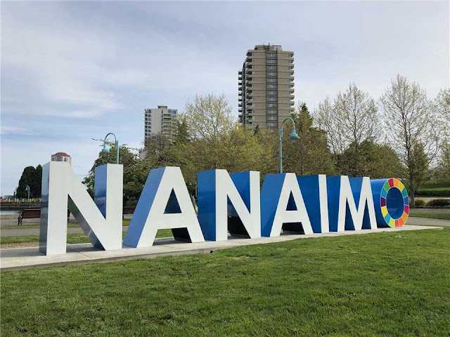
The multi-coloured "O" can draw attention, it can also confuse. Does it say NANAIMO or is it supposed to say NANAIM O?
The multi-coloured "O" introduces a visual break that makes the word feel disjointed. On a letterhead, the "O" would look like a separate logo or icon, not part of the word "Nanaimo."
If the sign is to tell people they are in NANAIMO, the word should be left, easy to read and remember.
If the purpose is to have a symbol communicating diversity or inclusivity it could better be achieved by developing a separate logo, icon or supporting graphic.
I doubt the current sign is any more or even as popular as the large picture frame that graced the park for many years. That sign didn't signal any message needing explanation.
This picture shows people are drawn to the sign, even without the multi-coloured "O".


It's actually a sustainable development logo of the UN. Either way it's not appropriate as the UN and their schemes never get to referendum they are just paused through.
ReplyDelete